

Fall and Winter months represent the best time of year to tackle interior projects and adding fresh paint to brighten up your decor can breath new life into your home. Colour is the one design element that can completely transform a room and is also the least expensive and easiest way to refresh a space.
But before you start painting your walls, you need to be sure you’ve selected the right colour for your space. Follow these Designer Tips to ensure your room makeover is a success.
A simple tip can go a long way in making a space more than just painted walls. The tips here require very little, if any, extra work, but the payoff is a more designed, more beautiful, more personalized space!
Designer Tips
Selecting The Right White

- Whites should only be used intentionally – not as a default color.
- If you use clean white, make sure your décor calls for a clean white.
- If your décor is warm, choose a creamy white to add warmth to the setting.
- Add softness with a tint of your favorite color.
Repeating Colors

- Repeat colors in a room at least twice to create a unified flow.
- Use your wall color at least one other time in your space, either in a throw pillow or a small accent piece.
- The repeated color will help to pull your style together
Neutral Décor

- Introduce small pops of color while still maintaining a soft, neutral overall look.
- If you prefer a crisp, neutral palette in your space, keep your furnishings and walls neutral and introduce small touches of color in your décor accessories.
Keeping Up With Colour
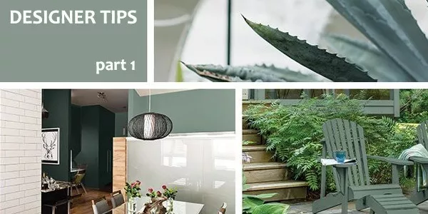
PPG Color Of The Year 2016: Paradise Found
Paradise Found is an organic, aloe green with an undertone of blue that offers at once a subtle, but serious sense of ease and rejuvenation. It is a steadfast, impenetrable color that fills today’s consumers need for sturdy reassurance against the growing threats to global, national and cyber security.

Paradise Found looks beautiful as an accent – either wall, ceiling, or door, interior or exterior. Paradise Found is a truly versatile hue.
Whether it’s the leaves on the trees or the latest catwalk fashion, colour is always changing. Check out these 2016 Design Trends from Voice of Colour and follow the link to find out more about Pittsburgh Paints.
I’m Perfect

Mixing the I’m Perfect with Imperfect, this trend is appreciating the perfection of imperfection. The colors are saturated and blended hues that hint at a vintage mildly at a bohemian spirit.
Hyper HD

By mixing dazzling brights with softer and neutral tones, the palette mimics the way the tech and natural worlds collide.
Lucid Dreams

Lucid Dreams is all about softness, fluidity and delicacy. Gentle combinations of nuanced pastels and light neutrals creates a soothing, quiet space.
Knight’s Watch

Knight’s Watch represents excellence, durability, protection and brawn. An army of darkened hues lend serious weight to the cleanliness and order of the soft whites.
Video Feature
Traditionally when picking a paint colour, we grab samples and swatches before running home and holding them or taping them against the wall. However, many Interior Designers recommend that you don’t hold paint swatches against the wall. Find out why in this short video feature.
[source]