

Choosing the right paint colour for your walls and mouldings is a big decision. It has to match your furniture, doors, decor, style, flooring and other rooms in the home.
You don’t want to put all that effort into painting, only to realise, you chose the wrong colour!
How can we make this decision easier for you? How about with tips from the experts…
DESIGN TIPS
- Blank palettes are easier to start from and allow you to choose any colour to suit your tastes.
- Most rooms you will need to match with fabric, flooring in order to make the room feel cohesive and usable.
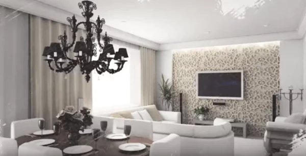
- Choose a consistent colour palette if your rooms are open and connected.
- If you have a long room or irregular walls paint a cool colour on the long walls, and a warm colour on narrow walls to make the room more balanced.
ADVICE ON CREATING COHESIVE DECOR
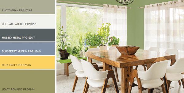
Once you decide on a colour scheme for your design project, you can use helpful online tools such as Pittsburgh Paints Voice of Colour. There you will find Harmony Chips which combine 5 colours that you can use to create cohesive and balanced room decor. These are great starting points that combine paint colours with those found in current textile market trends. You can pick up these Harmony Chips from POCO Building Supplies and test them on your own walls, with your lighting and against existing fabrics and features you want to tie into your room’s decor.
When working with colour chips, a common error is to hold them up against a white wall. Instead – use these chips against existing design elements to give you a clear visual clue as to whether or not they will work with other colours in your design scheme.
A great tip is to test these colour chips in various light conditions throughout the day so that you are sure you’re happy with how the light changes how the colour looks on your walls. Sometimes even a neutral beige can look pink in evening light – so you will need to be sure that your colour transitions successfully as the light changes throughout the day.
Tone-on-tone colouring or layering is a method designers use to create balanced decor in any room. This means taking a single colour or colours and uses a different saturation of each tone. You can dramatically transform a room by simply lightening a colour or shade.
PPG Pittsburgh Paints provides helpful hints on using colours in your home design projects. Visit Voice of Color for more tips and advice.